


Guest post by Amber Lucas, Calluna & Thyme
I’m Amber, I run Calluna & Thyme and I spent 14+ years inside the wedding industry before I started designing websites for wedding businesses. I sat across the table from couples in consultations, working wedding fairs, taking calls and in all of that, hearing exactly what made them choose us over another.
Sarah kindly asked me to come and share the fixes I see wedding pros miss over and over on their websites that, to be honest, are pretty simple swaps you could make even during peak wedding season.

Here’s 5 swaps you can make so your website starts showing people why you are the obvious choice:
1. A real photo of you
I see this a lot in the wedding industry where business owners don’t want to put their face to the brand. They don’t want to share a photo of them, or themselves in reels or content or throughout the website.
But I think this matters more in weddings than almost any other industry, especially if you’re a planner, photographer, makeup artist or hairstylist, or basically anyone who’s actually going to be with the couple up close and personal on the day.
Couples aren’t just booking a service, they’re booking a person, and they want to know: are they friendly? Do they seem like they know what they’re talking about? Do I want to spend the morning of my wedding with this person?
People don’t book based on personality alone, the work still has to be good, but personality is a much bigger part of that decision than people give it credit for. If there’s no photo, or it’s a stiff brand shot that looks like everyone else’s, couples can’t find anything to relate to. They can’t tell you apart from the next supplier as you’re not memorable enough to book in the first place.
2. White space
Cluttered pages make couples work to find what they want, and a lot of couples don’t want to work for it. Most of them already have a spreadsheet, a Pinterest board and about six other supplier tabs open and the wedding brain is already overwhelmed before it lands on your site.
Keep it simple and it’ll read as calm and competent, which is exactly what you want someone to feel before they hand you a chunk of their wedding budget.
3. Easy navigation
A third of engaged couples right now are Gen Z*, and they’re the generation that would rather send a text than pick up the phone – they want things quick and easy, and they want to find it fast.
*Source: Bridebook Wedding Report 2026
So if your website is a bit confusing, if there’s no pricing, if the portfolio’s hard to get to, if there’s no obvious next step, they’re not going to sit there working it out. They’ll just go find someone whose website explains it quicker.
Something else to think about is having your prices or at least an idea of a ballpark price on your website.
Nobody wants to go back and forth messaging five suppliers just to be told a number that was never going to work for them. They want to find out first, so they know whether they can even choose you.
A little note: If you can’t put prices on because you offer a completely bespoke service, then a way around this could be to add a few photos to your portfolio with prices on for that specific photo, so couples know a rough figure before getting in touch.
For the actual navigation, keep it to the basics: your logo (that’s clickable back to the homepage on every page), then About, Services, Portfolio and Contact. That’s the minimum. If you start naming things “our lovely services” or anything roundabout like that that’s where it can get confusing and cluttered – it needs to say exactly what it is so people know to click it.
And PSA…terms and conditions or your privacy policy don’t need to be up in the main menu, nobody’s landing on your site hoping to read those. Put them in the footer!
4. Embed your CRM contact form
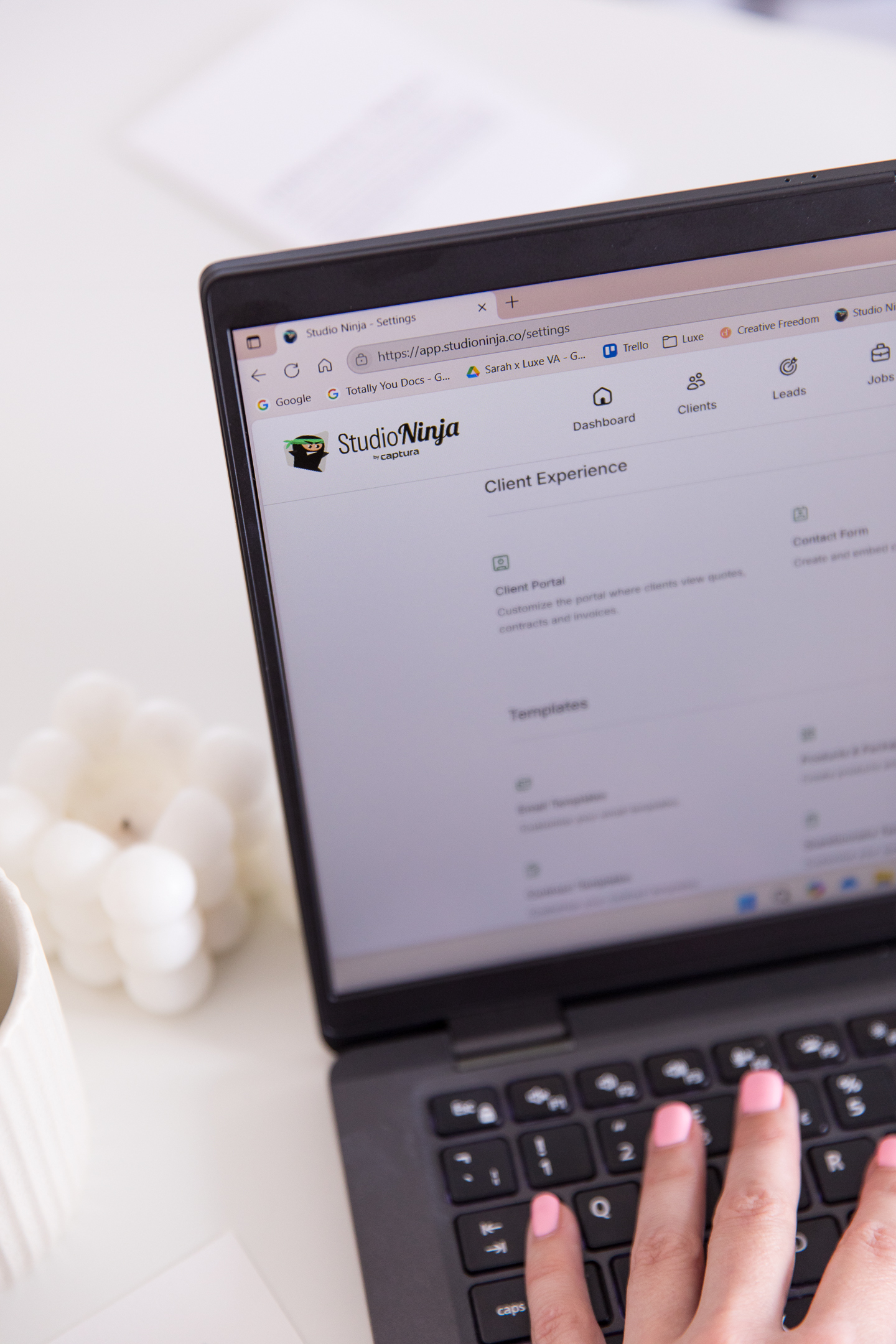
I see a lot of different CRMs being used across the wedding industry. Dubsado and HoneyBook are the big ones, Studio Ninja’s (affiliate link) a popular one too, and I personally use Ivorey.io (affiliate link) on GoHighLevel. Whichever one you’re on, embedding the actual form (instead of just building a contact form on your website platform) is a really good thing for you in the background – everything comes straight into your CRM, into a pipeline or a workflow, however you’ve got it set up.
It means you can send an automatic reply straight away with something like “thank you for getting in touch, I’ll be back to you within 24 hours, here’s a recent blog post in the meantime”, or even share availability from your calendar. Something that gives them an almost-immediate response so they know you’re there and their enquiry’s actually been received. Just keep it personal rather than generic robot-AI sounding copy, as this starts off the customer’s enquiry journey and can make or break whether they ghost or go on to book a call/book a trial/visit your venue.
The only downside is it can take a little while to load sometimes. But you get so much more freedom in how it looks and what it does for your admin, so it’s worth it.
And if you’re currently using a Google Form for this, then Sarah can actually do a CRM build for you inside a Studio Ninja (affiliate link), Wedola or Crevida.app setup!
And speaking of keeping things running behind the scenes, this is exactly the kind of thing Sarah and I love talking about and working on. I’ll happily talk your ear off about your website, and Sarah’s the one who makes sure everything else runs like clockwork in the background once the enquiry comes in. Got a folder of carousels sitting in Canva that never make it onto your grid? I can design them, Sarah can get them scheduled, and your socials are handled without you touching a thing!
5. A quick bit on SEO
Your page titles and your image alt text are two of the easiest wins on your whole site, and most wedding pros have never touched either.
Make sure your titles actually say what you do and where, and give your images a proper description instead of leaving them as IMG_4021. If you’re a wedding florist in Leicestershire and you worked a wedding at the Woodlands at Hothorpe Hall, then your image alt text could be “Rustic Wedding Flowers Leicestershire, Woodlands at Hothorpe Hall Wedding Florist”.
Something free from me
None of these things require an entire rebuild from your website. It’s the small, easy-to-miss stuff, the kind that’s costing you enquiries you’ve already earned through all the effort you’re putting into Instagram and elsewhere.
Now, you might be thinking, but Amber, how do I know what to change on my own website?! And the reason it’s more difficult when looking at our own website is because you’re the one person who can’t see your own site with fresh eyes, because you built it, you know where everything is, so it’s harder for you to see what’s missing or what needs to change.
That’s why I created my Little Pink Book. It’s my free insider guide to wedding business websites with 14+ years of wedding experience baked in.
It has a website diagnostic inside that tells you where you’re lagging on your messaging, positioning, SEO, leads and how your website’s actually telling your story, with tips so you know exactly how to fix each area!
It’ll help you show what’s different about your business and how to become the obvious choice to couples.
I’ve seen fixes like this give my client a 58% jump in enquiries in one month!
Grab the Little Pink Book here
About the author
Amber runs Calluna & Thyme, a Showit website design studio built for wedding industry professionals. After 14+ years working inside the wedding industry, she helps established wedding pros turn their website into one that actually books, rather than just sitting there looking pretty.
Take a look at her Showit templates, or go for the full done-for-you customisation if you’d rather hand it over completely. She also offers VIP Design Days, Wedding Business Strategy Intensives, and website audits if you just want to know what’s holding your website back. For copy, SEO and design all in one, there’s also The Flagship Website Experience with copywriter Jennie Hawkins.
You can explore more of Amber’s services on her website callunaandthyme.co.uk.




Comments +